
Business Intelligence Tools Won't Save You From Bad Data
- Business intelligence tools don't clean your data. They render it. A dashboard sitting on top of dirty data doesn't fix the dirt; it just gives the dirt a confident font and a trend line, so you make the wrong call faster and with better-looking slides.
- The trust problem is already here: 67% of organizations say they don't have complete trust in their own data for decision-making, up from 55% the year before, per Precisely's 2025 data integrity research.
- And we're not even looking: a 2025 leadership survey found 77% of leaders rely on dashboards but only sometimes or rarely question the numbers they're handed, according to TheyDo.
- The bill is real. Gartner pegs the average cost of poor data quality at roughly $12.9 million per organization per year, and IBM has put the US-wide figure at $3.1 trillion annually (IBM).
- The fix isn't a prettier dashboard. It's owning a few inputs that feed it: a definition, a source of truth, and someone accountable when the number is wrong.
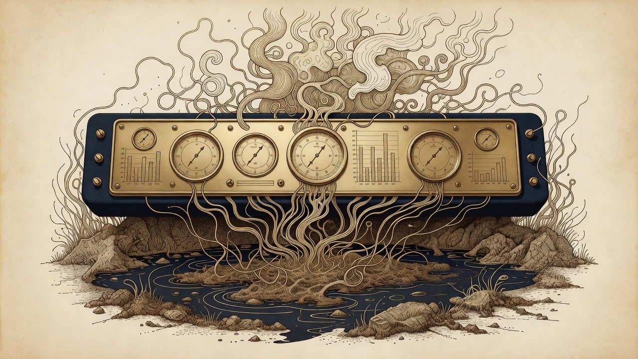
I sell software for a living, so it pains me a little to say this: business intelligence tools will not save you from bad data. They were never designed to. A BI tool is a very good window. It shows you, beautifully and in real time, whatever is on the other side of the glass. If what's on the other side of the glass is a swamp, you now have a high-resolution, color-coded, auto-refreshing view of a swamp. People keep buying the window and expecting it to drain the yard.
The thesis of this piece is uncomfortable and I'm going to repeat it until it sticks: a dashboard on top of dirty data just helps you be confidently wrong, faster. The confidence is the dangerous part. A spreadsheet you don't quite trust gets double-checked. A glossy dashboard with a green arrow gets believed, presented to the board, and turned into a hiring plan. The polish launders the error. I have watched a single mislabeled field send a perfectly competent leadership team marching, in formation, in the wrong direction, all of them pointing at the same chart for reassurance.
None of this is an argument against BI. I build on it constantly. It's an argument about sequence. You earn the dashboard by first owning the data underneath it, and almost nobody does the unglamorous part first, because the unglamorous part doesn't demo well.
Your Dashboard Is an Amplifier, Not a Filter
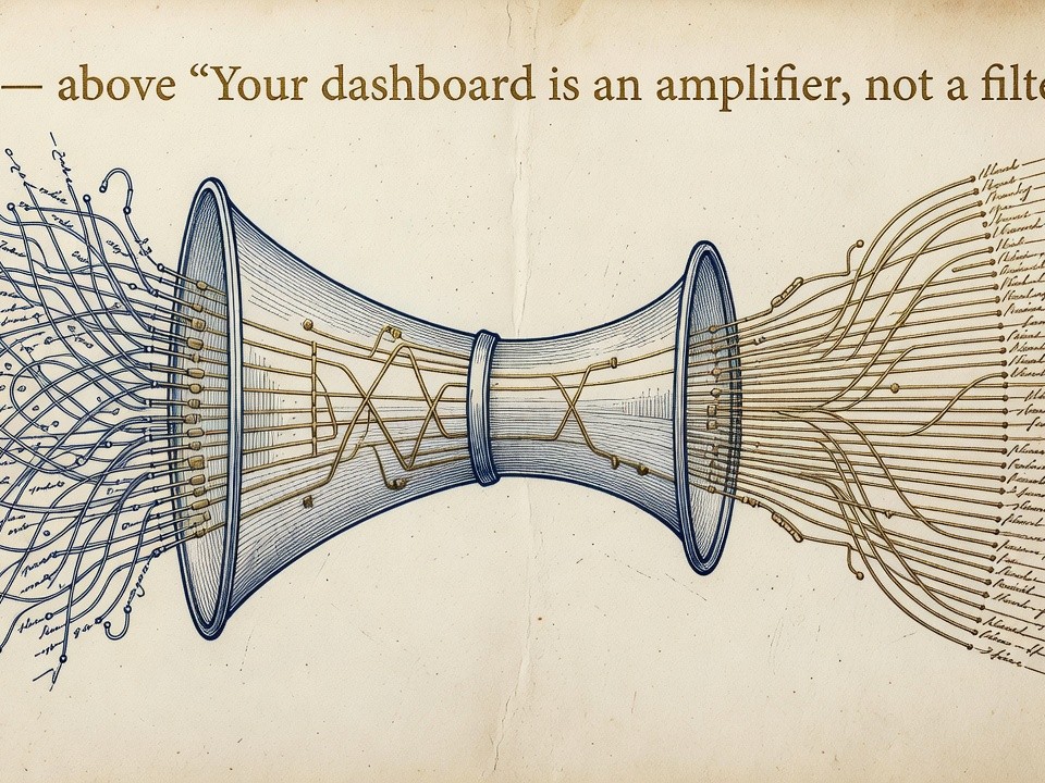
A BI tool faithfully amplifies whatever you feed it, which means it will broadcast your worst data with exactly the same confidence as your best. This is the single most misunderstood thing about the category. Buyers treat business intelligence tools as a kind of purification step, as though piping numbers through Power BI or Tableau or Looker scrubs them on the way in. It doesn't. The pipe is transparent. Garbage goes in crisp and comes out crisp, now with a sparkline.
Consider the mechanics of how a bad number actually does damage. Raw error sitting in a database is mostly inert; nobody's looking at it. The dashboard is what gives that error reach. It takes a wrong figure, aggregates it, color-codes it against a target, and pushes it to forty people every Monday morning. You have not added information. You have added distribution. The dashboard's whole job is to make a number persuasive, and it does that job whether the number deserves persuasion or not.
This is why the trust numbers are so grim even as adoption climbs. When two-thirds of organizations don't fully trust their own data, and 64% name data quality as their single biggest data integrity challenge (up from 50% in 2023, also per Precisely), it tells you the tooling has outrun the plumbing. Everyone bought the amplifier. Almost nobody serviced the source. So we've built, at considerable expense, an extremely efficient system for spreading our least reliable numbers to the largest possible audience.
Confidently Wrong Is More Expensive Than Visibly Unsure
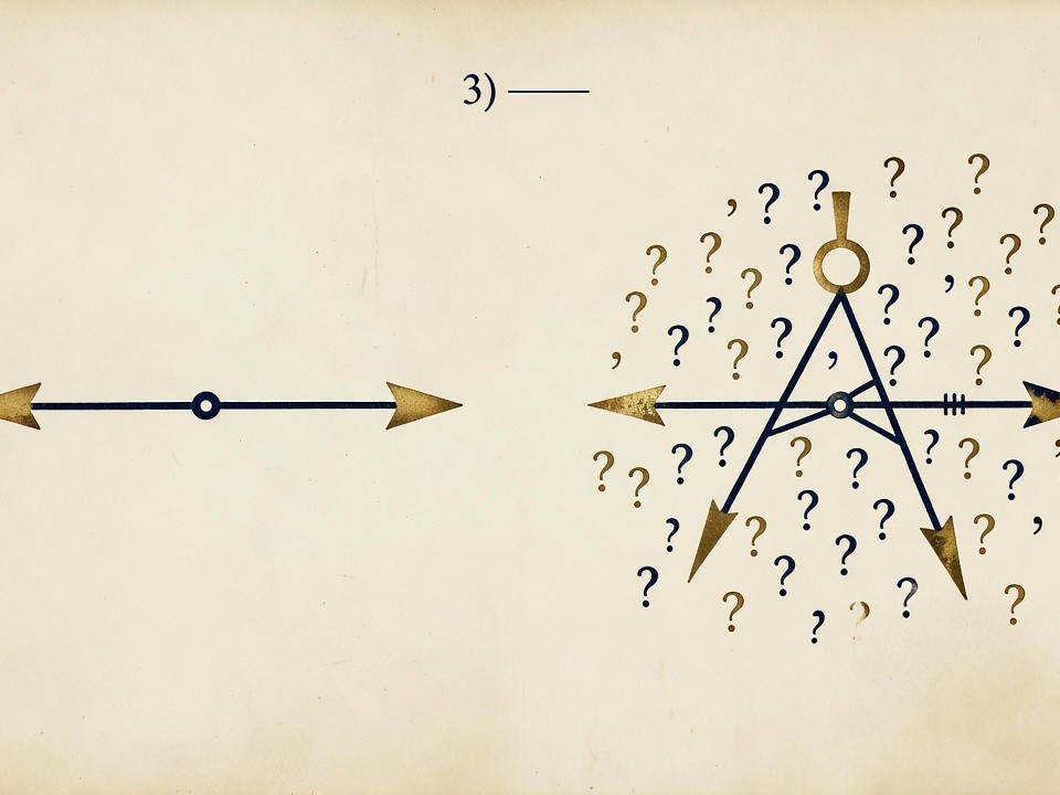
The most expensive state a company can be in is not "we don't know," it's "we're sure, and we're wrong." A dashboard manufactures certainty, and certainty short-circuits the instinct to verify. That instinct is the only thing standing between a bad number and a bad decision, and a green arrow quietly kills it.
The honest version of analytics says "here is what we measured, here is what we're unsure about, proceed accordingly." The dashboard version says "revenue is up 12%," full stop, in 48-point type. If that 12% rests on a customer table where someone duplicated an account import last quarter, you will not find out from the chart. The chart has no idea. It will report the inflated number with total composure, and you'll allocate next year's budget against a figure that doesn't exist. The cost shows up downstream, far from the dashboard, where nobody connects it back. Gartner's estimate of roughly $12.9 million a year per organization is mostly made of decisions like this: small data errors, confidently presented, compounded into real money.
Here's the part that should worry you more than the dollar figure. We've stopped checking. When 77% of leaders rarely question the dashboards they're handed, the verification step that used to live in a skeptical human has quietly been deleted from the process. The tool was supposed to support judgment. For a lot of teams it has replaced judgment, and the replacement doesn't know what it doesn't know. A person squinting at a weird-looking spreadsheet might catch the duplicate. A person nodding at a clean dashboard never will.

Fix the Inputs, Then Buy the Window
Earning a trustworthy dashboard takes three things, and none of them are a dashboard: a shared definition, a single source of truth, and a named owner who's accountable when the number is wrong. Do those first and the BI tool becomes what it was always meant to be, a window onto something real. Skip them and you've just bought a very expensive way to be misled on schedule.
Start with definitions, because most "data quality" disasters are really vocabulary disasters. Two departments report "active customers" and mean two different things, so the rolled-up number is meaningless before it ever reaches a chart. Write the definitions down. Boring, decisive, and the cheapest fix you will ever make. Then establish a source of truth for each key metric, one system that owns the canonical version, so you're not reconciling three dashboards that each insist they're right. This is also where the real labor of analytics actually lives: surveys consistently find data professionals spend something like 40% of their time just checking and wrangling data quality before any analysis happens, per Monte Carlo's research. If your experts are spending two days a week firefighting inputs, the inputs are the problem, not the visualization layer.
Last, give every metric that matters an owner, a specific human who's accountable when it's wrong and empowered to fix the source, not just annotate the chart. This is the part that converts data quality from a one-time cleanup into a standing discipline, and it's worth the awkwardness, because the alternative is institutionalized doubt. When 75% of leaders worry about trusting their AI and analytics systems, per the Dataiku Global AI Confessions Report, throwing another tool at the problem just adds a layer. Ownership removes one. Get the inputs right and your existing BI tool will suddenly look much smarter, mostly because it'll finally be telling the truth.
If you've got a beautiful dashboard nobody quite believes, the problem is almost never the dashboard. Book a Systems Diagnostic Call and we'll trace your numbers back to where they actually come from.

Frequently Asked Questions
Can Business Intelligence Tools Fix Bad Data Quality?
No. Business intelligence tools visualize data; they don't clean or correct it. Tools like Power BI, Tableau, and Looker render whatever sits in your source systems, so if that source is inaccurate, the dashboard displays an accurate-looking version of an inaccurate number. Data quality has to be fixed upstream, at the source, before the BI layer ever touches it.
Why Do Dashboards Make Bad Decisions Worse?
Because a dashboard adds confidence and distribution to a number without adding any correctness. A wrong figure sitting in a database is mostly harmless until a dashboard aggregates it, color-codes it against a target, and pushes it to the whole leadership team. The polish makes a bad number more persuasive and less likely to be questioned, which is exactly backwards.
How Much Does Poor Data Quality Actually Cost?
Gartner estimates the average organization loses around $12.9 million a year to poor data quality, and IBM has put the economy-wide US figure at roughly $3.1 trillion annually. Most of that isn't one dramatic failure; it's the slow accumulation of small errors, confidently presented and acted on, that only surface as cost much later and far from the original chart.
What Should I Fix Before Buying a BI Tool?
Fix three things first: shared definitions for every key metric, a single source of truth for each one, and a named owner accountable when a number is wrong. These are unglamorous and they don't demo well, but they're what makes a dashboard trustworthy. Buy the window after you've drained the swamp, not before.
Isn't This Just an Argument Against Business Intelligence?
Not at all. A good BI tool is genuinely valuable once the data feeding it is sound. The argument is about sequence: you earn the dashboard by owning the inputs first. A dashboard on clean, well-defined, well-owned data is one of the best decision aids you can have. The same dashboard on dirty data is a confident liar.